You’ve picked your fonts, chosen your favorite colors, and uploaded some photos you love. But when you look at your site… something feels off. Instead of polished and professional, it looks a little busy, mismatched, or just not you.
The problem usually isn’t your content — it’s consistency. As a designer, I can tell you that consistency is the difference between a website that feels thrown together and one that feels cohesive, trustworthy, and totally on-brand.
Today, I’m walking you through the three biggest visual elements of your site — fonts, colors, and photos — and how to use them strategically so your site not only looks good but feels like your brand.
Fonts: Establish a Hierarchy (Not a Free-for-All)
Fonts are powerful. They communicate personality, tone, and style. But when DIYers go font-crazy (hello, 6 different styles on one site), things get messy fast.
How to keep it consistent:
- Pick no more than 2–3 fonts. A heading font, a body font, and maybe one accent. Tools like FontPair and Google Fonts are great for finding combinations that work together.
- Create hierarchy. Your fonts should guide the eye through your content. Use a bold, larger font for headings, something simple and readable for body text, and an accent font sparingly for details.
- Mind your spacing. Pay attention to line spacing and letter spacing. Tight, squished text is hard to read; overly spaced-out text feels disconnected.
💡 Pro tip: Always test your fonts on mobile. A font that feels classy on desktop might shrink into unreadable specks on a phone.
Colors: Keep It Cohesive and Accessible
Color sets the mood of your brand, but too many DIY websites either use every shade of the rainbow or pick colors that don’t quite “play nicely” together.
How to keep it consistent:
- Stick to a palette of 3–5 colors. Typically: one main brand color, one accent, a neutral, and a light/dark variation for flexibility. Tools like Coolors and Adobe Color are lifesavers for building palettes.
- Use colors intentionally. Reserve your boldest color for calls-to-action (buttons and links). Keep background colors neutral so text stands out.
- Check accessibility. A beautiful color combo doesn’t help if people can’t read it. Use a tool like Contrast Checker to make sure your text color has enough contrast against your background.
💡 Pro tip: If you’re not sure where to start, pull your palette from a favorite photo or brand image using Coolors’ image picker.
Photos: Curate, Don’t Collect
Photos instantly set the tone of your site, but too often I see DIYers treat their homepage like a scrapbook — uploading every photo they like instead of curating for consistency.
How to keep it consistent:
- Choose images with a consistent style. Lighting, editing, and composition should feel cohesive across your site. Mixing warm, moody images with bright, airy ones creates visual whiplash.
- Quality matters. Blurry, pixelated images are a trust-killer. Stick to high-resolution photos, and compress them with TinyPNG before uploading to keep your site fast.
- Use stock photos wisely. If you don’t have your own brand photos yet, use cohesive stock from places like Unsplash or Pexels. Choose a set that feels aligned with your brand instead of mixing multiple styles.
💡 Pro tip: Want to make your images look more branded? Use Canva to add overlays, text, or frames that tie everything together.

Bringing It All Together
When fonts, colors, and photos work together, your website feels intentional and professional. Here’s a simple test:
- Do your fonts create a clear hierarchy?
- Do your colors feel cohesive and highlight the right elements?
- Do your photos feel like they belong in the same family?
If the answer is “yes,” you’ve nailed consistency. If not, start small: refine one element at a time until your site feels aligned.
Want a Shortcut to Visual Consistency?
This is exactly why I created the Website Design Ultimate Checklist. It walks you through every element of your site (not just visuals!) so you know exactly what to include for a polished, professional look.
👉 Download your free checklist here and save yourself from second-guessing every design decision.
Skip the Guesswork with a Template
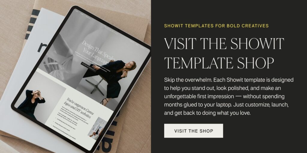
Fonts, colors, and photos are already thoughtfully chosen in my Showit Template Shop. Each template is professionally designed with consistent visual systems baked in — so instead of stressing over font pairings and color palettes, you can simply drop in your brand elements and know it’s going to look amazing.

Final Thoughts
Visual consistency isn’t about being boring — it’s about being recognizable. When someone visits your site, they should instantly feel the personality of your brand, not get distracted by mismatched fonts or clashing colors.
Keep it simple, intentional, and cohesive — and you’ll have a site that not only looks professional but also builds trust with your audience.
