If your website is your digital storefront, then your homepage is the front window display. It’s the very first impression most people will have of your brand — and you’ve got just a few seconds to convince them to stay, scroll, and (hopefully) click that “book now” or “shop” button.
Here’s the thing: most DIY websites either overload the homepage with way too much, or they keep it so minimal that visitors have no idea what they’re supposed to do next. The sweet spot is creating a homepage that’s clear, inviting, and strategic.
I want to share with you the exact formula I use when designing homepages for my clients (and what’s baked right into my templates). Think of this as a plug-and-play guide to building a homepage that actually works.
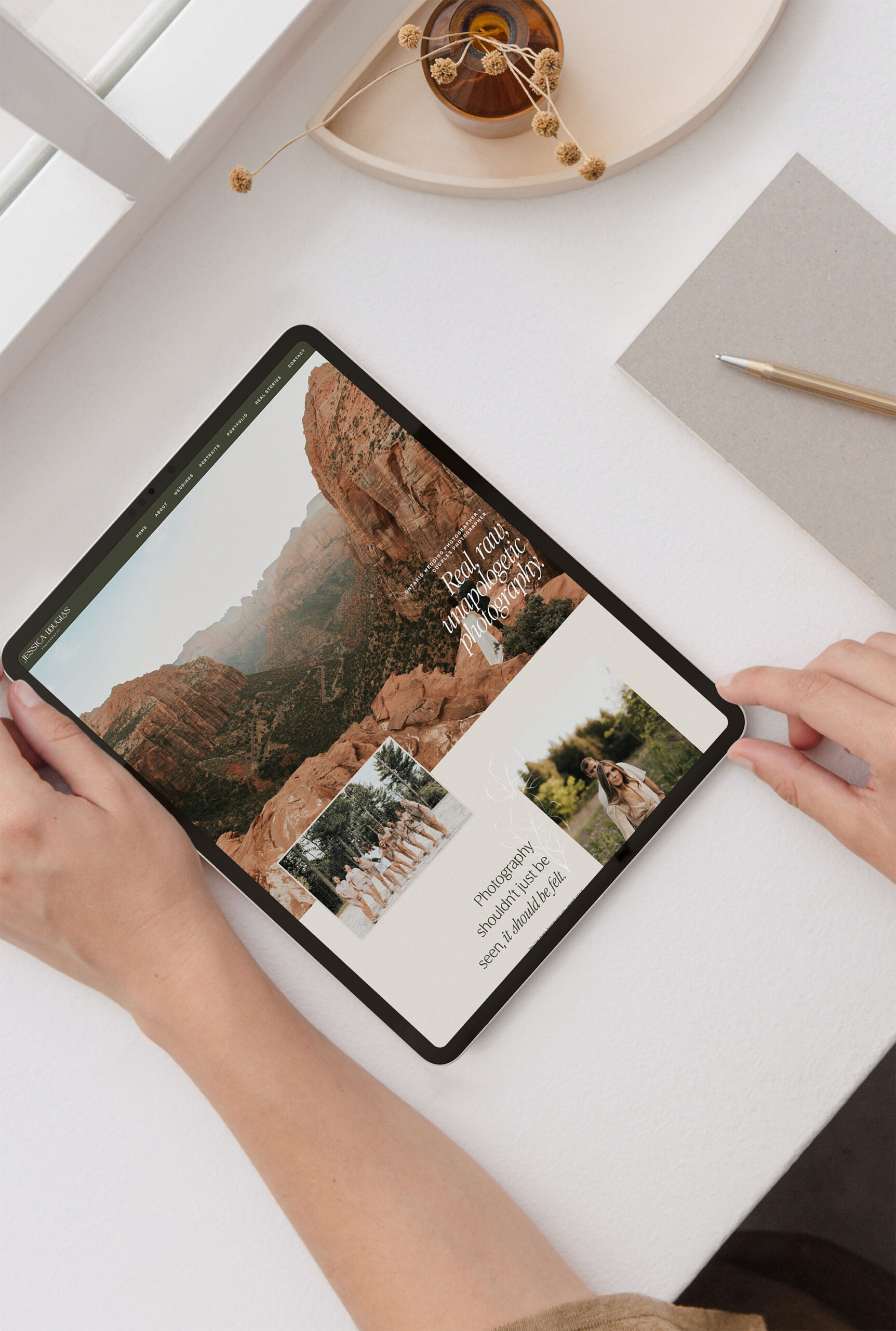
1. The Hero Section: Make a Strong First Impression
Your hero section is that big, bold area right at the top of your site. It usually has an image, headline, and a button.
What goes here:
- A clear statement about who you serve and how you help.
- A strong image (preferably YOU if you’re the face of your business, or something on-brand if not).
- One main call-to-action button — “Work With Me,” “Shop Now,” “Book a Session.”
💡 Pro tip: Skip the fluffy tagline like “Welcome to my website!” and instead say something like:
“Timeless photography for joyful, adventurous couples in Boise, ID.”
This tells people instantly if they’re in the right place. For great free stock images if you don’t have brand photos yet, I recommend Unsplash or Pexels.
2. A Quick About Section
Visitors want to know there’s a real person or business behind the brand. But they don’t need your entire life story up front.
What goes here:
- A warm photo of you (or your team).
- A short 2–3 sentence blurb about who you are and what you do.
- A “Learn More” button linking to your full About page.
This is just a teaser — not the whole meal. If you’re struggling with what to write, tools like Grammarly can help polish your copy so it’s clear and engaging.
3. Showcase Your Services or Offerings
This is where you show people what you actually do or sell. Too many homepages skip this step and leave visitors confused.
What goes here:
- 3–4 core services or products with a short description of each.
- A button that leads to your Services or Shop page.
- Eye-catching visuals or icons to keep it skimmable.
For icons, I love The Noun Project — it’s a treasure trove of clean, professional graphics that instantly elevate your design.

4. Social Proof: Build Trust Quickly
People want to know if you’re legit before they invest in you. That’s where testimonials or proof of past work come in.
What goes here:
- A rotating slider of client testimonials.
- Logos of brands or publications you’ve worked with (if applicable).
- A favorite before/after example or case study.
Need a simple way to gather testimonials? Use Google Forms to send a quick survey to past clients, or try Typeform for a more polished experience.
5. A Glimpse of Your Portfolio or Work
Show, don’t just tell. Even one or two examples of your work can give potential clients confidence.
What goes here:
- A grid of 3–6 images that link to your portfolio or blog.
- If you don’t have visual work, showcase client results, case studies, or data instead.
If you want to make these visuals shine, you can use a free design tool like Canva to create mockups or clean image layouts.
6. Lead Capture: Grow Your Email List
Don’t miss the chance to collect leads right on your homepage.
What goes here:
- A freebie (like my Website Design Ultimate Checklist 🙌).
- A quick blurb explaining the benefit: “Grab this free checklist and make sure your site is ready to wow your clients.”
- A simple email opt-in form with minimal fields (just name + email).
If you’re not sure how to set up forms, platforms like Flodesk (my favorite for beautiful, simple email marketing) or ConvertKit make it easy to connect your opt-in to your email list.
7. A Final Call-to-Action
Your homepage should always end with a clear next step. By this point, someone knows who you are, what you do, and whether they like what they see. Now tell them where to go.
What goes here:
- A bold, full-width section with a single CTA:
- “Book Your Design Intensive”
- “Browse the Template Shop”
- “Schedule Your Free Call”
Keep it simple and irresistible.
Putting It All Together
When you follow this homepage formula, your site flows naturally:
- First, people know what you do.
- Then, they connect with who you are.
- Next, they see your offers, proof, and examples.
- Finally, they get a clear invitation to take action.
No confusion, no overwhelm — just a strategic path that guides them toward working with you.
Want Help Nailing Your Homepage?
I created the Website Design Ultimate Checklist to help you make sure every page of your site has the right elements in place (not just your homepage). It’s a free, step-by-step guide that walks you through the must-haves for a professional, client-ready site.
👉 Download the checklist here and set yourself up for a website you’re proud of.
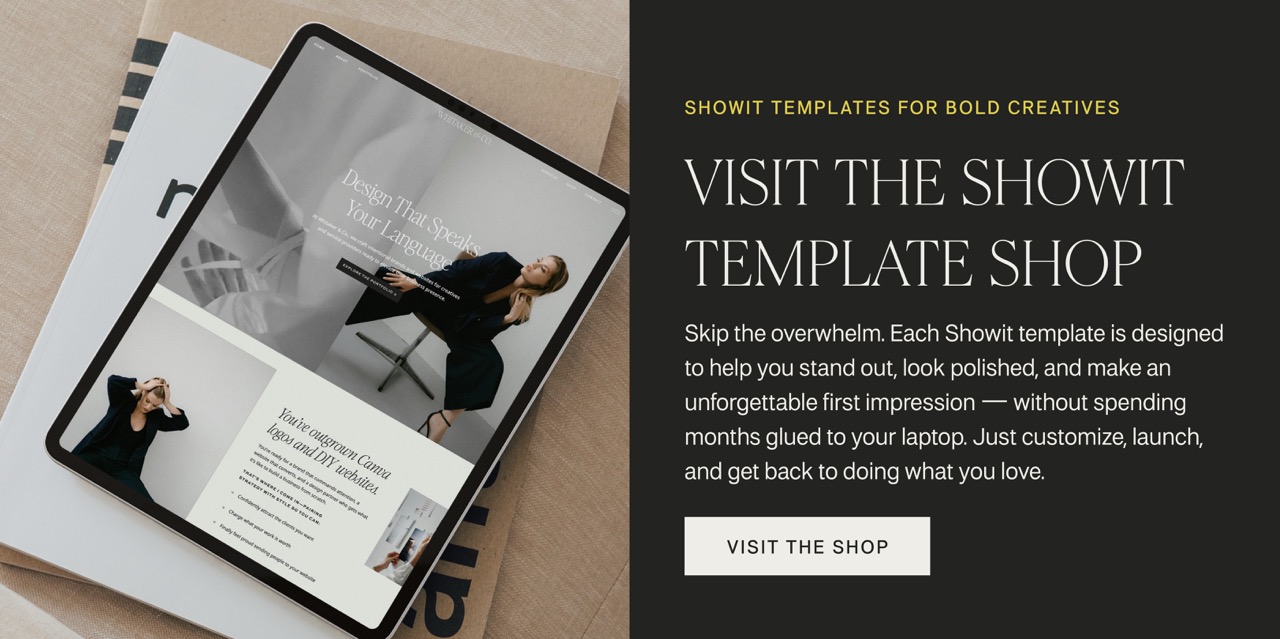
Skip the Guesswork with a Template
If you’re feeling overwhelmed trying to put all these pieces together from scratch, you don’t have to. My Showit Template Shop is full of professionally-designed templates that already follow this exact homepage formula.
That means you can open up a template, drop in your content, and know your site is designed to impress — no second-guessing required.
Final Thoughts
Your homepage doesn’t have to be complicated, but it does need to be strategic. Think of it as a warm welcome and a roadmap rolled into one. When you combine clarity, social proof, and a strong call-to-action, your homepage becomes more than just pretty — it becomes a tool that works for your business.


