A dated ski cabin in the Catskills gets new life as a hip, modern boutique Airbnb.
Project Overview
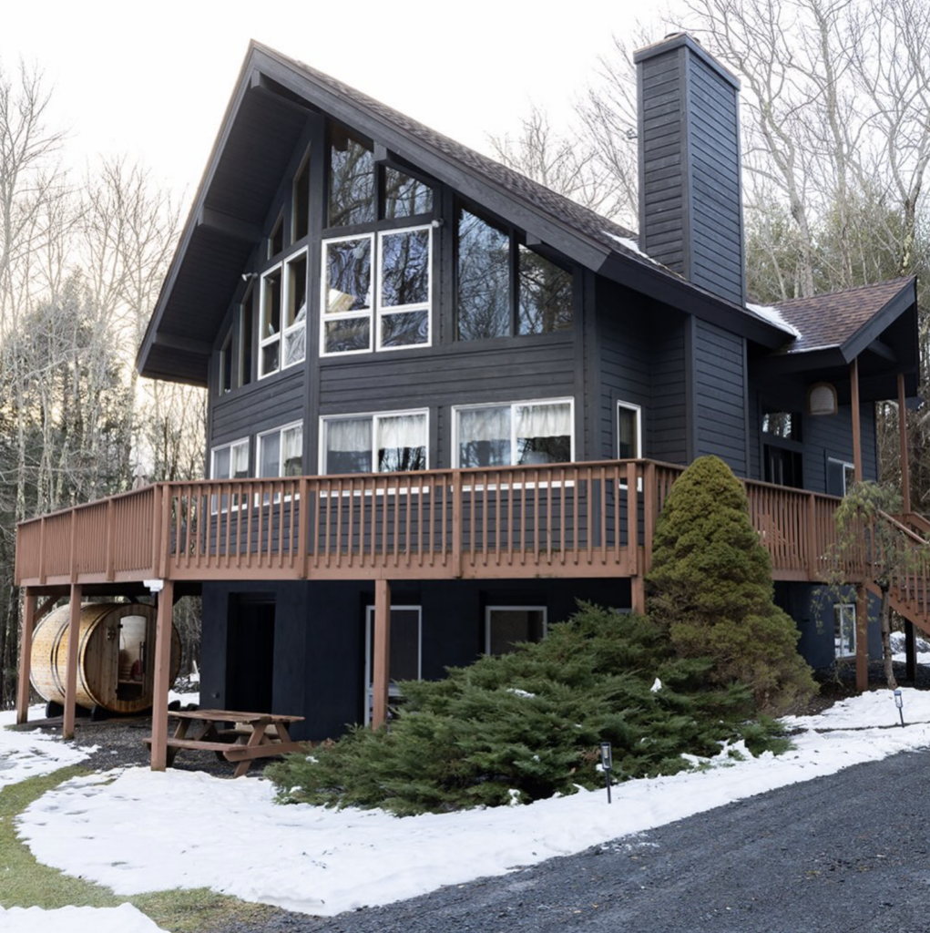
When my client Jen, an interior designer I’ve had the pleasure of working with before, reached out about branding her newest venture, I knew right away this was a project I’d been waiting for. Jen was transforming a dated 1980s ski chalet in the Catskills into Oakwood Retreat: a fully renovated, design-forward Airbnb built for guests who want to unplug, slow down, and reconnect with nature without giving up an ounce of style.
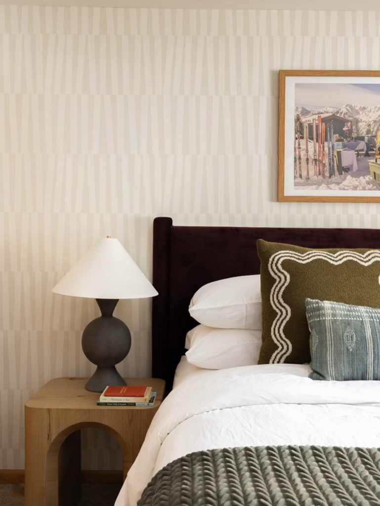
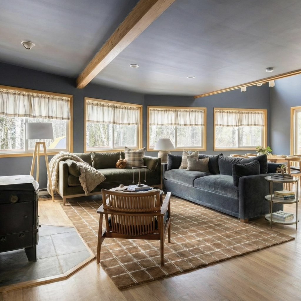
Jen’s vision for the interior was clear from the start: midcentury warmth meets modern comfort. Deep charcoal exteriors, warm wood tones, brass fixtures, vintage-inspired furniture, and cozy textures that feel both timeless and lived-in. My job was to build a brand identity that didn’t just sit alongside that interior design, but felt like it grew out of it, so that from the moment a guest sees a listing photo to the moment they check in and spot a coaster on the coffee table, the experience feels seamless.
This project holds a special place for me personally, too. I’ve always wanted to design for a short-term rental or boutique hospitality brand. There’s something uniquely satisfying about creating a visual identity for a space whose entire purpose is to be an escape. Getting to build that world for Oakwood Retreat, in a setting as beautiful as the Catskills, felt like a perfect match.
The Brand Strategy
Before touching any design elements, the goal was to define what Oakwood Retreat needed to feel like: relaxed but elevated, nostalgic but current, rustic but not rough. Guests booking a Catskills getaway want an experience, not just a place to sleep, so the brand needed to promise that escape before they ever set foot on the property.
We landed on an identity built around the idea of a “midcentury mountain hideaway,” something that could live comfortably next to the wood beams and vintage furnishings Jen was sourcing for the interior, while still feeling fresh enough to stand out in a sea of rustic-cabin Airbnb branding.
Logo & Typography
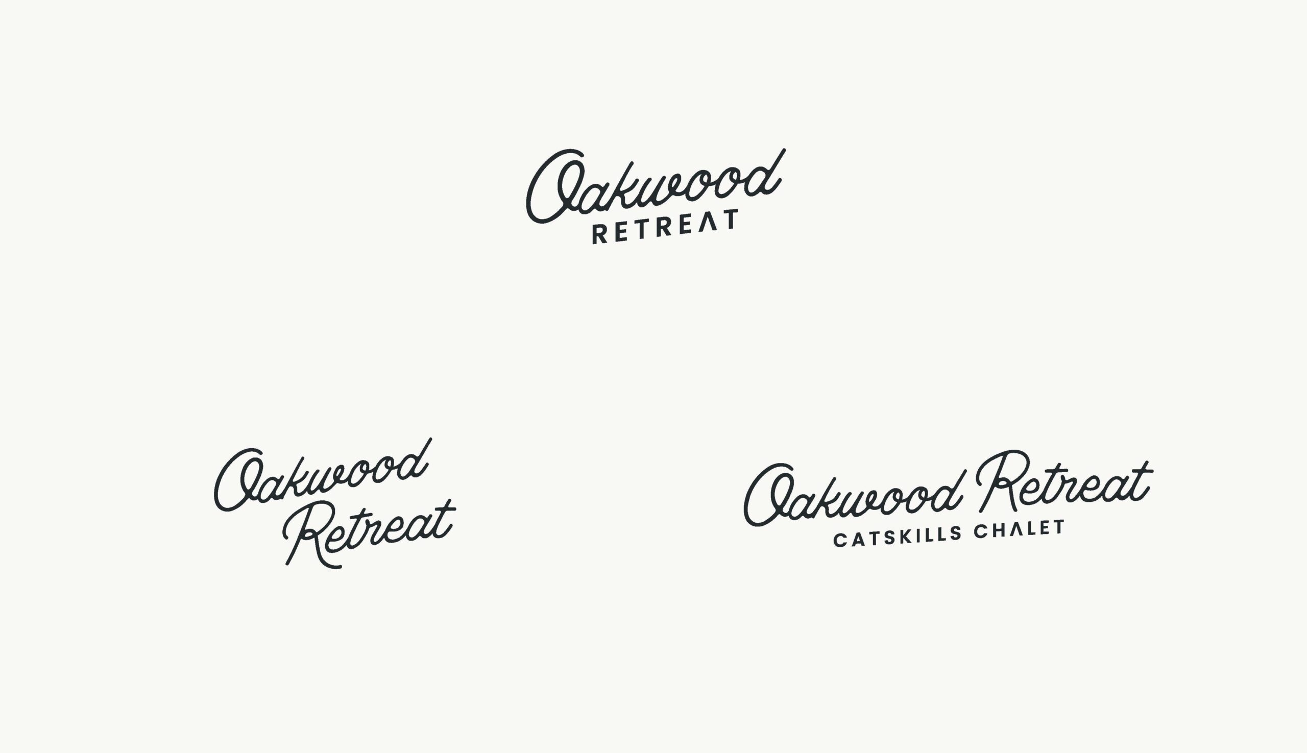
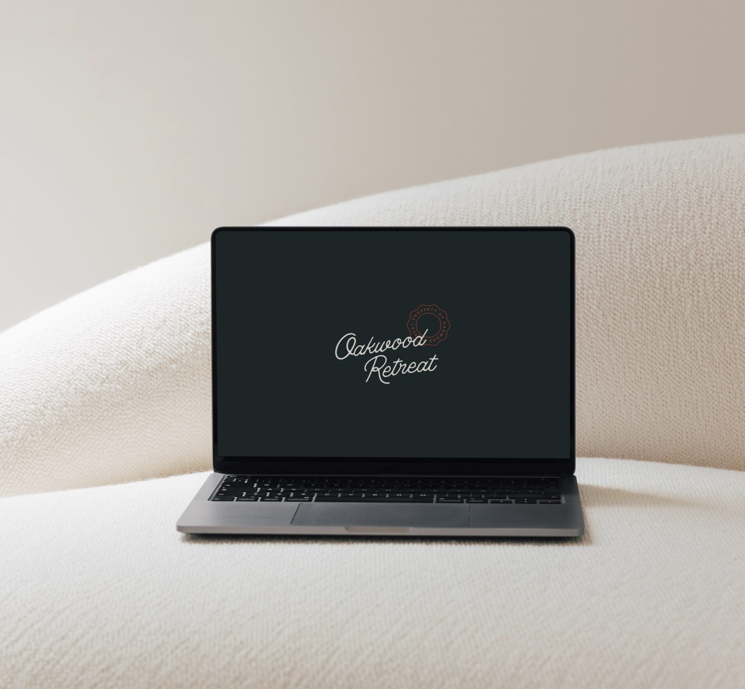
The primary logo pairs a free-flowing script, used for “Oakwood,” with a clean, modern sans serif for “Retreat.” That contrast was intentional: the script brings in warmth, movement, and a playful, retro-postcard energy, while the sans serif keeps things grounded and legible, especially at small sizes on signage or products. A secondary lockup adds “Catskills Chalet” beneath the primary mark for use in contexts where location matters, like listing headers or welcome signage.
Color Palette
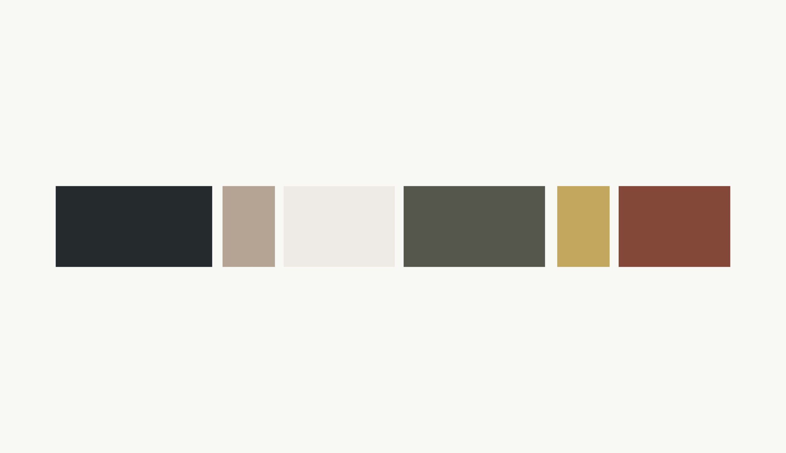
The palette pulls directly from the interior finishes Jen was already using inside the home, so the two would feel like one cohesive story rather than two separate design decisions. It includes:
- A deep charcoal/near-black (echoing the home’s exterior siding)
- A warm taupe
- A soft cream
- An olive green
- A mustard gold
- A rust/brick red
Together, these colors read as autumnal and grounded, perfectly suited to a mountain property, while still feeling considered rather than “cabin cliché.”
Brand Marks & Extended Elements
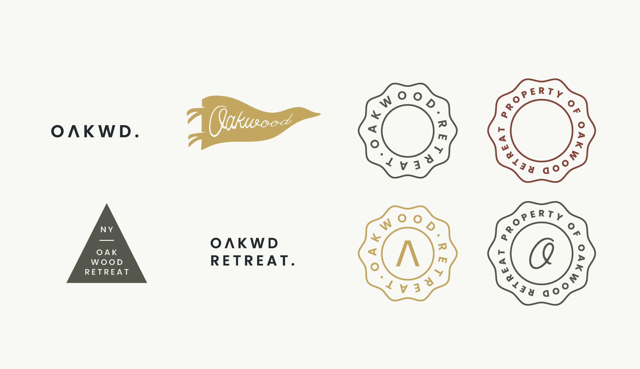
Beyond the primary logo, we built out a full system of supporting marks to give the brand flexibility across everything from digital use to physical signage:
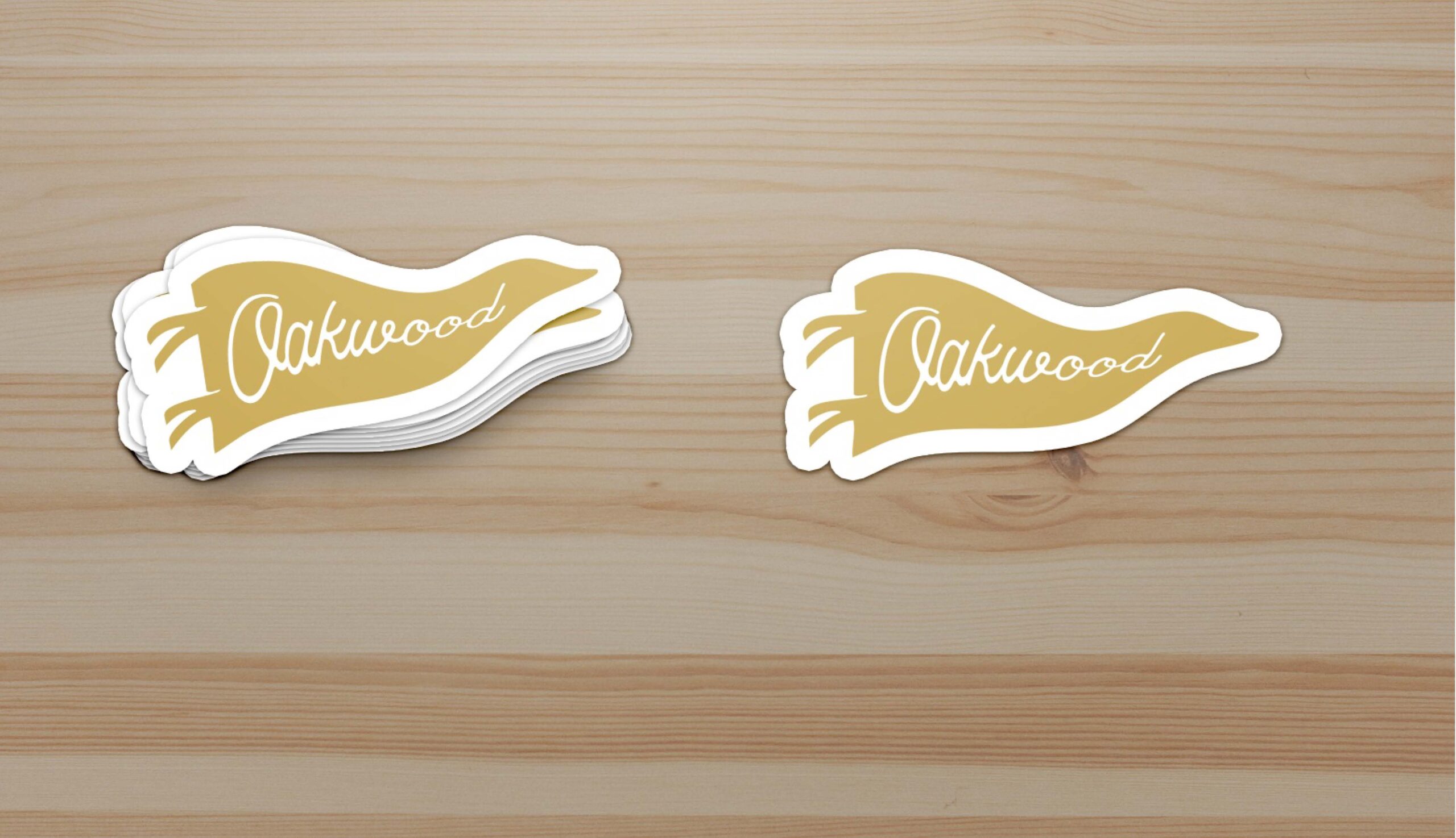
- A pennant flag graphic, referencing the vintage camp and lodge pennants Jen incorporated into the interior styling, a small but meaningful detail that ties the brand directly to the physical space.
- A set of vintage-style badge marks, including a scalloped seal badge and a “property of” stamp-style badge, to round out the system with a collected, well-worn charm.
- A monogram-style icon mark and simplified wordmark for smaller applications like pens and embossing.
Bringing the Brand to Life Across the Property
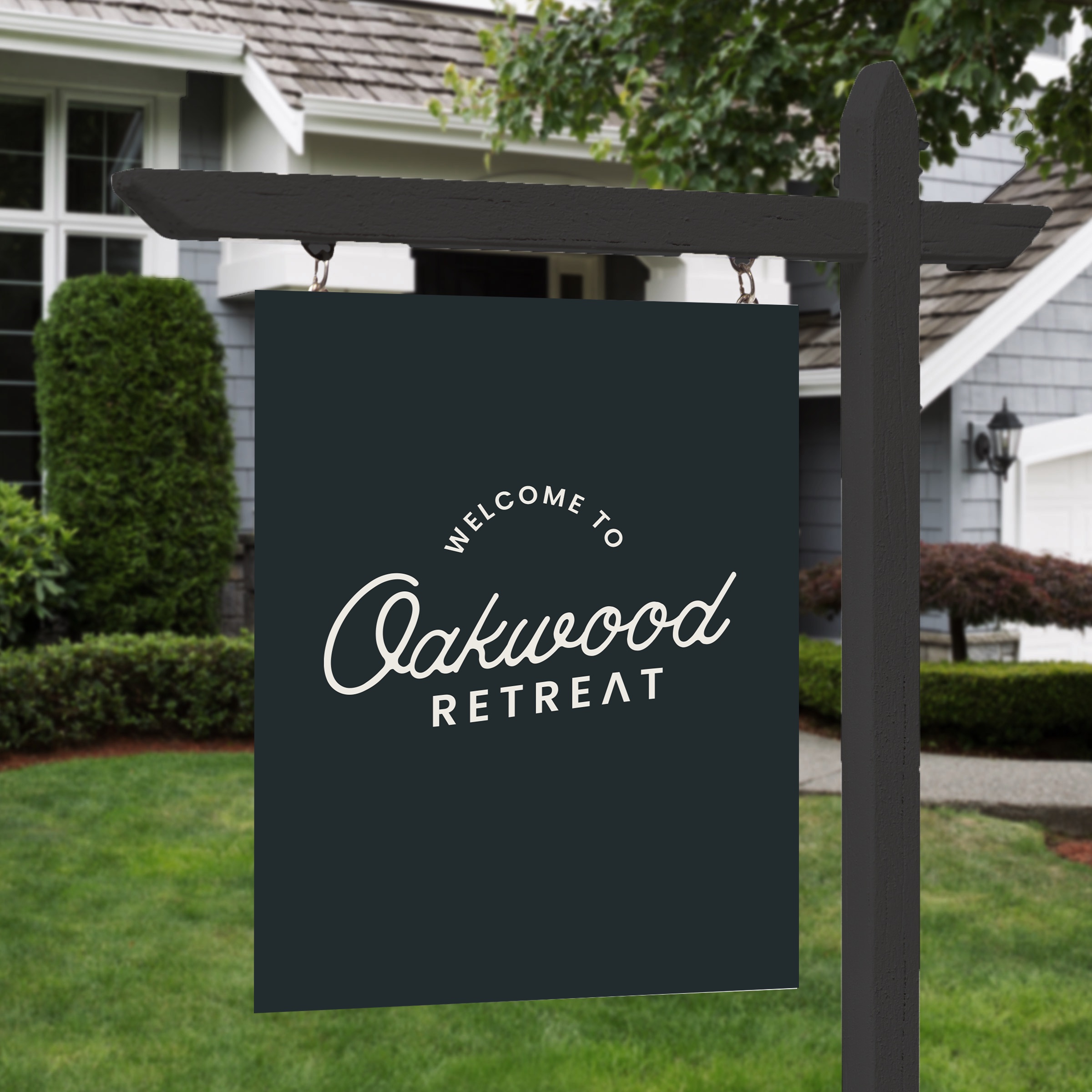
The real magic of a hospitality brand happens when it shows up in the guest experience itself, and that was a big focus for this project. The Oakwood Retreat identity was applied across:
- Entry signage welcoming guests to the property
- Stickers featuring the pennant mark
- Branded pens, using the simplified “OAKWD.” wordmark
Every one of these small details works together to reinforce the same message: that this stay has been thought through, down to the last detail, and that guests are somewhere special.
The Result
Oakwood Retreat’s brand identity now does exactly what it was designed to do: it sets guest expectations before they arrive, and then delivers on that promise at every touchpoint once they’re there. It’s a brand that feels like an extension of Jen’s interior design work rather than a separate layer on top of it, informed by what’s happening inside the home, while communicating the sense of escape and experience that guests can expect the moment they book their stay.